MY BLOG

 1. The process was a little confusing but I got the hang of it after a practicing a bit.
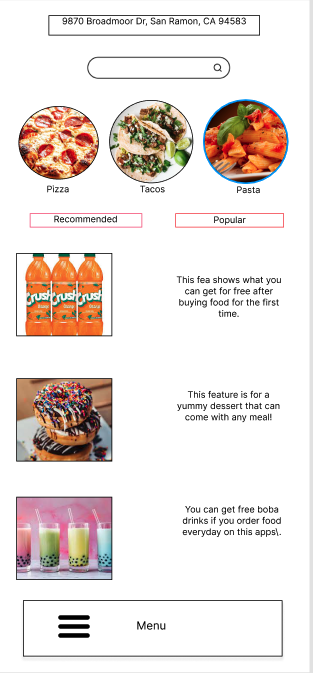
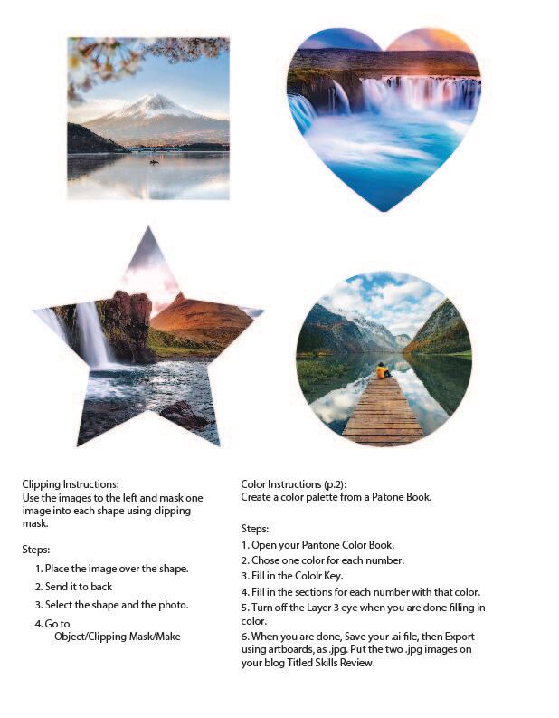
2.The easiest part was placing the images into the circles 3. The most difficult part was creating the shapes and figuring out where to put them. 4. Because I thought the icons fit well with the whole design.
0 Comments
Part 1:
1. After watching this video, I feel bad that she struggles and has to go through what she's going through. 2. As a designer I would try to create things that would help her and make her feel like she's not alone in her situation. I would try to make her feel welcomed and that she belongs. 3. I would call it difficult since she struggles to do things everyday in her life but also strong since she can see the positive things in her life. Part 2: 1.Experience Strategy, User Research, and Information Architecture. 2. Don Norman 3. He studied electrical engineering and mathematical psychology 4. His 1988 book The Design of Everyday Things remains a sort of UX bible touting iterative development and frictionless relationships between user and object. 5. discoverability and understanding. 6. Affordances are signals that people try to find out what an object is without any directions. They involve visible and invisible stuff without it being in the object. 7. Signs that include the meaning of things to help people guide them through something such as the sign of a door that has the word push on it. 8. seven stages of product design 9. can result in a lack of consciousness about said product’s true inner-workings, resulting in a ‘dumbing down’ of user behavior. 10. Because you've got to understand wha the customers want first so that the people get what they want from the design. They wouldn't be happy if you don't listen to want they want. Part 3: 1. Headspace because it helps you relax and shows you how to mediate. Shazam because it's very helpful when you are trying to find the name of a song that is playing out loud. 1. I learned that it's better to not over share and to be mysterious because you are more interesting that way and not everyone has to know everything about you.
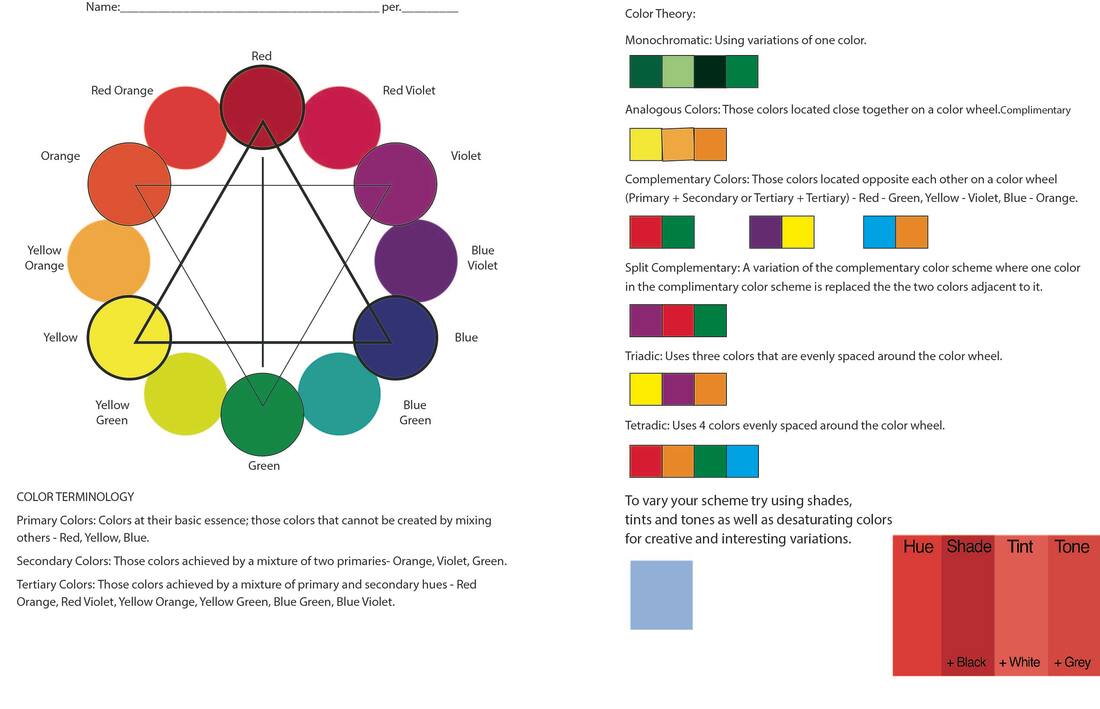
2. Yes, because I think his designs are unique and colorful. 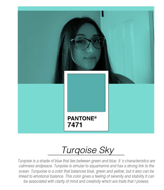 1. Something new I learned was using the Pantone color and blending it with the selfie on illustrator.
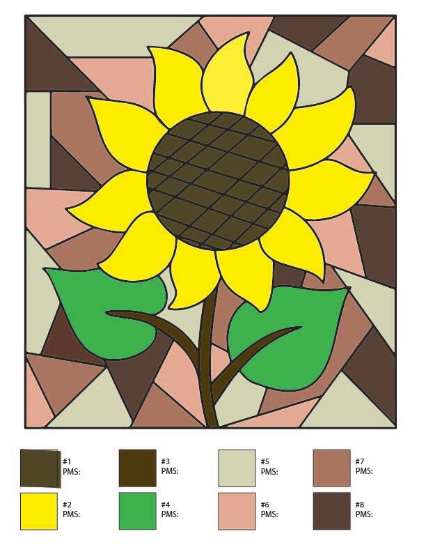
2. I wasn't surprised that this was my signature color because this color represents my character traits and it makes sense since its a blue. 3. A complementary color would be coral #F5987D. 4. A analogous color would be green #019875 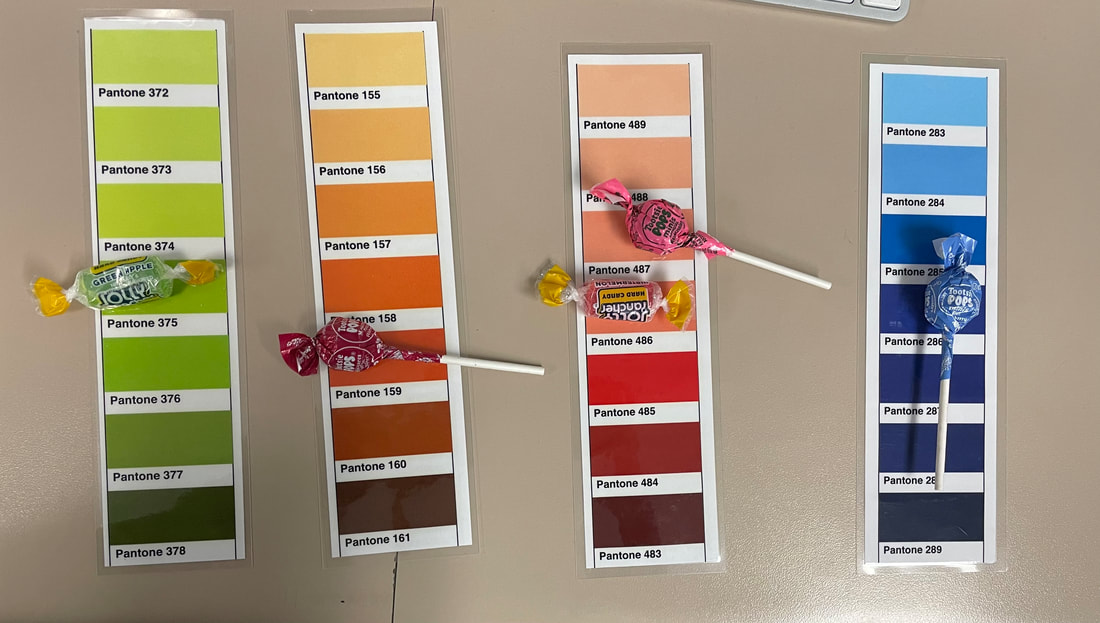 1. It was easy to decipher the colors because there was different shades of each color to use.
2. It improves it by having more of a variety of the same color so it's not just the one color. 3. A good time to use this is when we do logo designs. 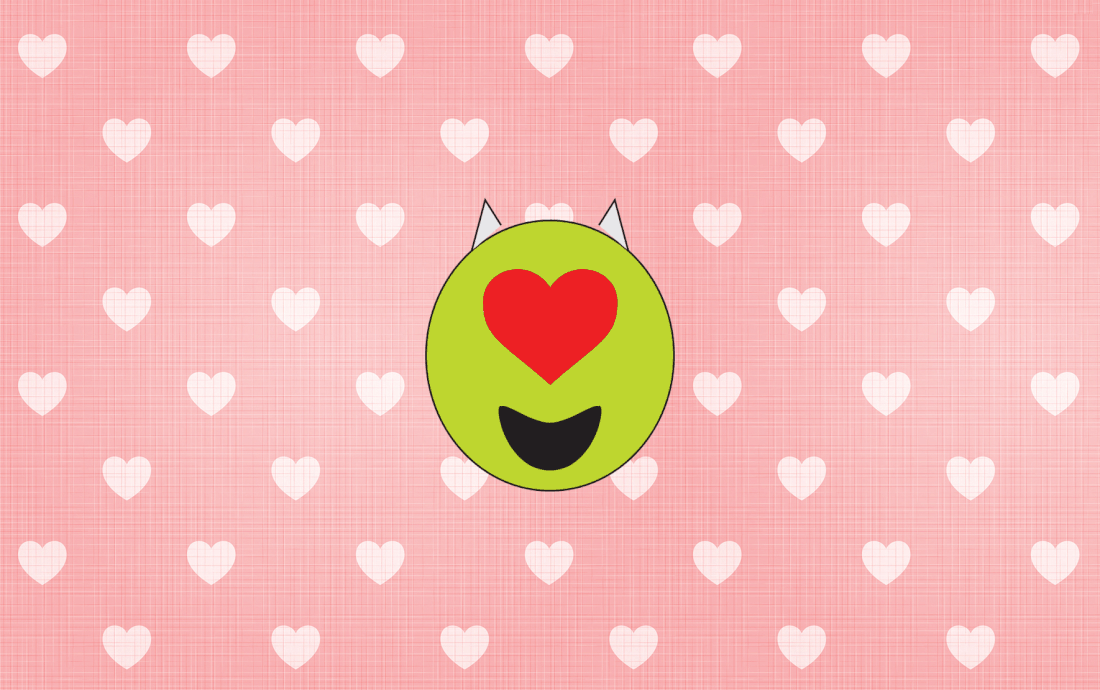 1. I'm animating the heart crumpling then going back up.
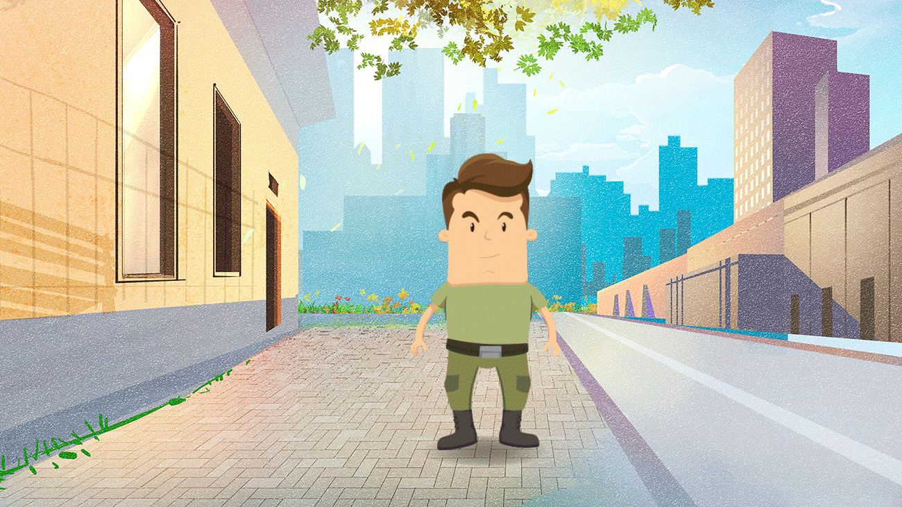
2. I think it was pretty easy using the puppet warp because you can change a certain part without changing the whole face. 3. I like how simple it is. 4. I wouldn't change anything |
Archives
May 2022
Categories |
 RSS Feed
